This is the first in a three part series on aid workers and risk. Follow us via email (click the link on the right) or twitter (@aid_leap) for the next installments. Part 2 is available here. Part 3 focuses on South Sudan and is available here.
Humanitarian aid work is a dangerous occupation: this is not news. Publications such as the yearly Aid Worker Security Report do much good to highlight some of the risks faced by aid workers. However, this blog argues both the nature and the risks faced by aid workers are misunderstood by many agencies and aid workers.
During a training at a major INGO aimed at preparing aid workers for their first deployment, I was presented with versions of these two charts:


I was told the first chart showed the risks to humanitarian aid workers had increased dramatically in the last decade, while the second showed which countries where the most dangerous for aid workers. Unfortunately, as we’ll show on this blog, neither of those conclusions can be made from the data presented in these charts.
Without knowing the number of total aid workers, data on aid worker victims (either by country or by year) doesn’t provide much information. The graphs above don’t tell us anything about risk because they don’t have any information about the number of aid workers: has the number of aid workers stayed constant during the last decade? Is the number of aid workers in Somalia and Syria the same? I think not.
In the UK, London has 8 times more people killed or seriously injured in traffic accidents than Cambridge. But it would be very wrong to conclude London is 8 times more dangerous than Cambridge. London has more traffic accidents than Cambridge because it has a great many more people and cars. The same applies to aid worker victims. All other things being constant, one would expect twice the number of victims if one doubled the number of aid workers.
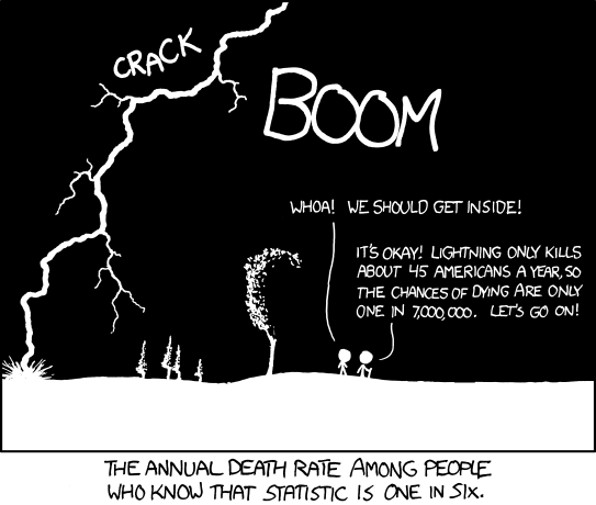
From XKCD.com
There is very little available data on the number of aid workers in different countries/years. Most aid workers know just how difficult it can be to count the people who benefit from aid interventions. I feel we should have an easier time counting the number of staff. Humanitarian Outcomes, who are responsible for the Aid Worker Security Database and many works on aid worker security, are working on a new database to fill the evidence gap on the number of aid workers.
With the 2013 Aid Worker Security Report about to be published, we are likely to see quite a bit of these graphs. I’d like for more people to understand what they mean – and what they do not mean. Hopefully this year we’ll see less articles drawing the wrong conclusions from the data. In particular, I’m hoping for less articles claiming ‘The data says X country is the most dangerous for aid workers!’
We know that the number of aid workers has increased over the last decade. Without taking variations in the number of aid workers into account, the Aid Worker Security Report doesn’t demonstrate an increase in risk. I know the authors understand this well: they presented great data on risk in their Providing Aid in Insecure Environments: 2009 update. While I recognise the lack of data is a problem, I feel this limitation should be noted in the report, for the benefit of those who will mistake absolute numbers for risks or rates.
___
Definitions and further reading:
The misunderstanding is mostly due to a lack of understanding of the meaning of risk. There are many definitions of the word risk, but most of these relate to the probability of uncertain future events. Risk is a measure of probability. To understand risk, one has to understand probabilities. And therein lies the problem.
Aid workers should be interested in risks and rates (or relative risks and rate ratios, which are the comparisons of risks and rates respectively). Risk (also called absolute risk) is the probability that an event will occur. Whereas ‘rate’ is a measure of the frequency at which an event occurs.
Data for this blog was obtained from Humanitarian Outcomes (2013), Aid Worker Security Database, https://aidworkersecurity.org/, as well as from the Aid Worker Security Report 2013 Preview.
This link has a list reports drawing on data from the Aid Worker Security Database.
Prefer more academic papers? Death among humanitarian aid workers, while from 2000, is a good place to start. For a review of the literature over the last 5 years, you could try this paper.
Prefer reading blogs? You could try NGO Security.
Want more resources? Try some of these.
Is all of this too depressing? Comics about risk from xkcd here and here.

Always been surprised by agencies not knowing how many staff they have. When I’ve encountered this problem in the past, I’ve found that the finance department/whoever deals with payroll actually does have a very good idea of who works there (people tend to be grumpy if they don’t get paid). So it’s a more a question of lack of data sharing as opposed to lack of data.
Pingback: Aid Workers and Risk – Part 2 | AID LEAP
Pingback: Aid Workers and Risk – Part 3: South Sudan Dangers | AID LEAP
Pingback: Security of Aid Workers: What about National Staff? | AID LEAP