Summary:
- DFID annually reviews the performance of every programme they fund, and publishes this information online.
- We read 600 randomly chosen annual reviews, in order to look for patterns in the scores awarded by the reviewers.
- We found relatively little variation in the data; 64% of programmes got an average score (A, “meeting expectations”), with less than 4% receiving the lowest or highest scores (2% received C, 2% received A++).
- Programmes are scored both during and after implementation. During implementation, programmes are more likely to be scored average (A) grades, and less likely to be scored a high or low grades. Only 2% of annual reviews award a ‘C’, but 8% of post completion reviews do. I suspect annual reviewers favour average grades in order to avoid the potential negative consequences of extreme grades. This represents a missed opportunity to highlight underperformance during implementation, when it is still possible to improve.
- There is substantial grade inflation over time. This might be because programmes are getting better at setting expectations that they can meet. This casts doubt on the validity of the annual review process; if the current trend continues, by 2018 95% of programmes will receive an A or higher.
- This blog is the second in a series examining DFID’s annual reviews. For the first blog, examining the weird grading system that DFID uses, click here. Future blogs will suggest ways in which grading can be improved.
Full blog:
DFID annually reviews the performance of every programme they fund, in order to challenge underperformance, suggest improvements and learn from both successful and unsuccessful programmes. The results are published online, demonstrating an admirable commitment to transparency and scrutiny, and supplying fantastic data on the effectiveness of DFID’s programmes. To my knowledge, however, annual reviews have not been externally researched. This is for a simple reason; annual reviews are lengthy word documents, with no easy way to download and analyse them. I estimate that there are at least twenty million words of text available online, growing by around five million a year.
Fortunately, I have quite a lot of spare time and some extremely tolerant friends, so we decided to read annual reviews for a randomly selected 600 out of the 4,000 projects available online, and note down the scores given for each annual review and post completion review. With the help of the amazing IATI data, we compiled a spreadsheet listing the vital details of all projects such as spend, sector and country, alongside the grades awarded by DFID for the achievement of outputs and outcomes. This blog presents some of the findings.
What are annual reviews and post completion reviews?
To understand this exercise – and the limitations – you need to understand how DFID’s reviews work. Each DFID programme has a results framework, which sets annual performance milestones against each indicator.[1] In an annual review, the programme is scored according to whether it met the annual output milestones or not. The programme is awarded A++ if it ‘substantially’ exceeded expectations, A+ if it ‘moderately’ exceeded expectations, A if it met expectations, and B or C for not meeting expectations. Receiving a B or a C is a big deal; a programme that gets two Bs in a row or a single C can be put on a performance improvement plan, and might be shut down. Annual reviews happen (as the name suggests) every year. Post completion reviews are conducted at the end of the programme, and award a score, using the same weirdly inflated grading system, for achievement of both outputs and outcomes.
The remainder of the blog presents some of the findings, alongside my attempts to explain them. Please note that I analysed just the grades – leaving the other twenty million letters of the reviews untouched. More in-depth research might be able to validate some of my theories and suggestions, and would be a promising future research project.
There is little variation in the scores awarded for annual reviews
Fully 64% of the annual reviews in my dataset received an A grade, indicating that the project is meeting expectations. Less than 2% received an A++, and less than 2% received a C. (See the table below).
| AR Scores | # Projects | % projects[2] |
| A++ | 10 | 2% |
| A+ | 104 | 17% |
| A | 397 | 64% |
| B | 92 | 15% |
| C | 15 | 2% |
This makes it harder to conduct analysis into the factors affecting the scores given, and so was a bit of a disappointment for me. It is not, however, an issue for DFID. There is no objective, correct percentage of programmes that should be exceeding or failing to meet expectations. DFID could reasonably argue that, since a ‘C’ is effectively a mark of failure, you wouldn’t want more than 2% of programmes in the portfolio to receive it. Programmes which get a ‘C’ may anyway be shut down, so there’s a natural bias against having many Cs in the portfolio, given the effort that goes into launching a programme in the first place.
Post completion reviews show more variation in grades than annual reviews, and a lot more negative scores
Post completion reviews and annual reviews both rate the programme on the outputs achieved. It turns out that post completion reviews have a lot more variation. They are less likely than annual reviews to give an A, but more likely to give every single other grade. (See figure 1 below).

In particular, post completion reviews are much more likely than annual reviews to award a ‘C’ grade. Overall, 15 annual reviews (2% of the total) award a C grade; of which 13 are in the first year of project implementation. By contrast, 8% of post-completion reviews award a ‘C’ for the outputs achieved.[3] (See figure 2 below).

There are a number of possible reasons for this. One potential reason is that programmes really do worse in their final year of implementation, perhaps because problems become harder to hide, or staff leave for new jobs and it becomes difficult to recruit new ones. This seems unlikely, however, as the annual review data suggests that programmes actually get better at hitting output targets as programme implementation continues. (See next section).
Consequently, this seems to reflect a flaw in the review process; DFID’s ongoing monitoring is more positive than the review at the end of the programme. It may be that more end-of-programme reviews are done by external reviewers, who perhaps have a more negative view of programmes achievement. I don’t have data on who these reviews were conducted by, unfortunately.
I suspect the lack of variation in the scoring is also due to risk aversion on the part of DFID’s annual reviewers. In particular, a ‘C’ rating has serious consequences, and can lead to a programme being shut down. This can make DFID staff look bad, creates extra work for everyone involved, and leads to difficulty in spending allocated budgets. A post completion review does not have these consequences, as the programme has already finished and can’t be shut down. By contrast, an ‘A’ is an extremely safe option to give; it expresses reservations without any serious impact on the project. This could lead to reviewers giving more ‘A’ grades than they should.
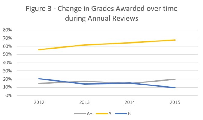
There is grade inflation over time
Since the first set of annual reviews in 2012, the percentage of ‘A’ grades has steadily increased (from 56% in 2012 to 68% in 2015) and the number of ‘B’ has decreased (from 21% in 2012 to 10% in 2015). This is shown in figure 3 below. The same trend is apparent in post completion reviews, where the number of ‘B’s awarded has plummeted from 30% in 2012 to 7% in 2015.
The same trend is apparent if you look at the scores awarded to a single programme, separated out by the first, second and third annual review. Between the first and the third annual reviews the percentage of A+s and A++s increases, while the number of Bs and Cs reduces. (Shown in figure 4, below).The number of As also increases, from 57% in the first year to 64% in the third, but I haven’t included it in this graph as it distorts the scale.

An optimist would conclude that programmes are getting better – but I don’t know of any other evidence which suggests that there has been a dramatic change, either positive or negative, in programme quality between 2012 and 2016. It could also be that the worst performing programmes are getting shut down, which would lead to an overall positive trend in the data.
Having experienced several annual reviews first-hand, I suspect that programmes are getting better at setting targets below the minimum achievable level. Of course, there is no incentive to set an ambitious target and not meet it; while there are plenty of incentives to set a modest target and exceed it.
While this is partially a good thing – there’s no point in programmes failing because they set unrealistic targets – it threatens to make the whole process meaningless. For example, if the current trend continues, by 2018 95% of programmes will receive an A or higher in the annual review. DFID needs to strengthen incentives to set ambitious targets which really allow programmes to be held to account.
Conclusion
The arguments presented above do not suggest that DFID’s annual reviews are uniformly useless. The score is just one facet of an annual review, and in many ways the hardest one to get right. DFID deserves credit for doing and publishing annual reviews at all, and those who have experienced them will know that they often include hard questions and rigorous scrutiny.
Overall, however, this analysis suggests problems with the review process. Firstly, programmes are more likely to receive an average ‘A’ rating during implementation than on closure, and much more likely to receive a ‘C’ rating once implementation has finished. I suspect the likely cause is risk-aversion on the part of the reviewer, which reflects a missed opportunity to highlight underperformance when improvements are still possible. Secondly, grades are improving over time. While this probably represents an improvement in the ability of programmes to set realistic targets, it also risks devaluing the annual review process, if expectations are set so low that everyone meets them.
This analysis would have benefited from a larger sample; I only sampled 15% of the total number of programmes. It also hasn’t criticised the underlying logic of annual reviews, although it could be argued that programmes should be annually assessed on the likelihood to reach outcomes, not just outputs achieved. Additional insights would have been gained from a qualitative analysis of the annual reviews, as well as the quantitative analysis. Any keen students or researchers want to take on the task?[4]
[1] This is almost always in the form of a logical framework.
[2] Rounded to the nearest percentage. In some of these tables, not all of the scores add up to 100%. This is normally because of missing data in the ARs; not all have awarded grades.
[3] A bit of care needs to be taken in interpretation. The strength of this evidence is limited by the size of the sample; very few programmes get Cs, and so comparisons are naturally tricky. The ‘year 1’, ‘year 2’ and ‘year 3’ annual reviews are defined in relation to how many annual reviews the programme has had; so they actually might happen in different years. More programmes have had a year 1 annual review than a year 2 or 3 review, for example. Likewise, the post completion reviews aggregate things that have happened in different years. Finally, not all programmes which have had an Annual Review have had a post completion review, and vice versa.
[4] If so, please email us at aidleap@gmail.com. We’re happy to share the data we’ve received so far.
