Summary:
- DFID annually reviews the performance of every programme they fund, and publishes this information online.
- We read 600 randomly chosen annual reviews, in order to look for patterns in the scores awarded by the reviewers.
- We found relatively little variation in the data; 64% of programmes got an average score (A, “meeting expectations”), with less than 4% receiving the lowest or highest scores (2% received C, 2% received A++).
- Programmes are scored both during and after implementation. During implementation, programmes are more likely to be scored average (A) grades, and less likely to be scored a high or low grades. Only 2% of annual reviews award a ‘C’, but 8% of post completion reviews do. I suspect annual reviewers favour average grades in order to avoid the potential negative consequences of extreme grades. This represents a missed opportunity to highlight underperformance during implementation, when it is still possible to improve.
- There is substantial grade inflation over time. This might be because programmes are getting better at setting expectations that they can meet. This casts doubt on the validity of the annual review process; if the current trend continues, by 2018 95% of programmes will receive an A or higher.
- This blog is the second in a series examining DFID’s annual reviews. For the first blog, examining the weird grading system that DFID uses, click here. Future blogs will suggest ways in which grading can be improved.
Full blog:
DFID annually reviews the performance of every programme they fund, in order to challenge underperformance, suggest improvements and learn from both successful and unsuccessful programmes. The results are published online, demonstrating an admirable commitment to transparency and scrutiny, and supplying fantastic data on the effectiveness of DFID’s programmes. To my knowledge, however, annual reviews have not been externally researched. This is for a simple reason; annual reviews are lengthy word documents, with no easy way to download and analyse them. I estimate that there are at least twenty million words of text available online, growing by around five million a year.
Fortunately, I have quite a lot of spare time and some extremely tolerant friends, so we decided to read annual reviews for a randomly selected 600 out of the 4,000 projects available online, and note down the scores given for each annual review and post completion review. With the help of the amazing IATI data, we compiled a spreadsheet listing the vital details of all projects such as spend, sector and country, alongside the grades awarded by DFID for the achievement of outputs and outcomes. This blog presents some of the findings.
What are annual reviews and post completion reviews?
To understand this exercise – and the limitations – you need to understand how DFID’s reviews work. Each DFID programme has a results framework, which sets annual performance milestones against each indicator.[1] In an annual review, the programme is scored according to whether it met the annual output milestones or not. The programme is awarded A++ if it ‘substantially’ exceeded expectations, A+ if it ‘moderately’ exceeded expectations, A if it met expectations, and B or C for not meeting expectations. Receiving a B or a C is a big deal; a programme that gets two Bs in a row or a single C can be put on a performance improvement plan, and might be shut down. Annual reviews happen (as the name suggests) every year. Post completion reviews are conducted at the end of the programme, and award a score, using the same weirdly inflated grading system, for achievement of both outputs and outcomes.
The remainder of the blog presents some of the findings, alongside my attempts to explain them. Please note that I analysed just the grades – leaving the other twenty million letters of the reviews untouched. More in-depth research might be able to validate some of my theories and suggestions, and would be a promising future research project.
There is little variation in the scores awarded for annual reviews
Fully 64% of the annual reviews in my dataset received an A grade, indicating that the project is meeting expectations. Less than 2% received an A++, and less than 2% received a C. (See the table below).
| AR Scores | # Projects | % projects[2] |
| A++ | 10 | 2% |
| A+ | 104 | 17% |
| A | 397 | 64% |
| B | 92 | 15% |
| C | 15 | 2% |
This makes it harder to conduct analysis into the factors affecting the scores given, and so was a bit of a disappointment for me. It is not, however, an issue for DFID. There is no objective, correct percentage of programmes that should be exceeding or failing to meet expectations. DFID could reasonably argue that, since a ‘C’ is effectively a mark of failure, you wouldn’t want more than 2% of programmes in the portfolio to receive it. Programmes which get a ‘C’ may anyway be shut down, so there’s a natural bias against having many Cs in the portfolio, given the effort that goes into launching a programme in the first place.
Post completion reviews show more variation in grades than annual reviews, and a lot more negative scores
Post completion reviews and annual reviews both rate the programme on the outputs achieved. It turns out that post completion reviews have a lot more variation. They are less likely than annual reviews to give an A, but more likely to give every single other grade. (See figure 1 below).

In particular, post completion reviews are much more likely than annual reviews to award a ‘C’ grade. Overall, 15 annual reviews (2% of the total) award a C grade; of which 13 are in the first year of project implementation. By contrast, 8% of post-completion reviews award a ‘C’ for the outputs achieved.[3] (See figure 2 below).

There are a number of possible reasons for this. One potential reason is that programmes really do worse in their final year of implementation, perhaps because problems become harder to hide, or staff leave for new jobs and it becomes difficult to recruit new ones. This seems unlikely, however, as the annual review data suggests that programmes actually get better at hitting output targets as programme implementation continues. (See next section).
Consequently, this seems to reflect a flaw in the review process; DFID’s ongoing monitoring is more positive than the review at the end of the programme. It may be that more end-of-programme reviews are done by external reviewers, who perhaps have a more negative view of programmes achievement. I don’t have data on who these reviews were conducted by, unfortunately.
I suspect the lack of variation in the scoring is also due to risk aversion on the part of DFID’s annual reviewers. In particular, a ‘C’ rating has serious consequences, and can lead to a programme being shut down. This can make DFID staff look bad, creates extra work for everyone involved, and leads to difficulty in spending allocated budgets. A post completion review does not have these consequences, as the programme has already finished and can’t be shut down. By contrast, an ‘A’ is an extremely safe option to give; it expresses reservations without any serious impact on the project. This could lead to reviewers giving more ‘A’ grades than they should.
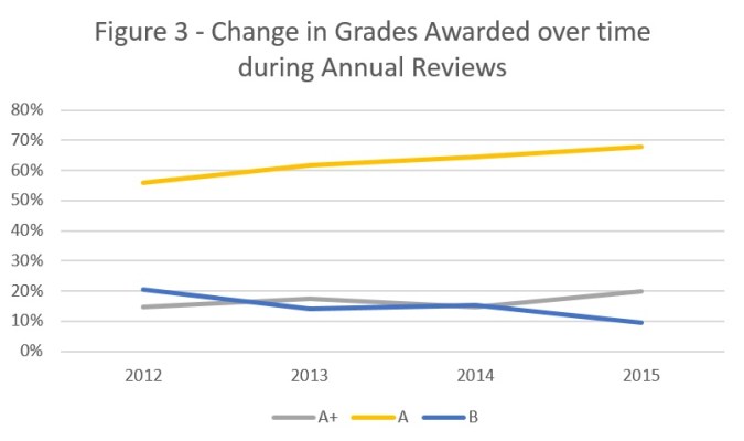
There is grade inflation over time
Since the first set of annual reviews in 2012, the percentage of ‘A’ grades has steadily increased (from 56% in 2012 to 68% in 2015) and the number of ‘B’ has decreased (from 21% in 2012 to 10% in 2015). This is shown in figure 3 below. The same trend is apparent in post completion reviews, where the number of ‘B’s awarded has plummeted from 30% in 2012 to 7% in 2015.
The same trend is apparent if you look at the scores awarded to a single programme, separated out by the first, second and third annual review. Between the first and the third annual reviews the percentage of A+s and A++s increases, while the number of Bs and Cs reduces. (Shown in figure 4, below).The number of As also increases, from 57% in the first year to 64% in the third, but I haven’t included it in this graph as it distorts the scale.

An optimist would conclude that programmes are getting better – but I don’t know of any other evidence which suggests that there has been a dramatic change, either positive or negative, in programme quality between 2012 and 2016. It could also be that the worst performing programmes are getting shut down, which would lead to an overall positive trend in the data.
Having experienced several annual reviews first-hand, I suspect that programmes are getting better at setting targets below the minimum achievable level. Of course, there is no incentive to set an ambitious target and not meet it; while there are plenty of incentives to set a modest target and exceed it.
While this is partially a good thing – there’s no point in programmes failing because they set unrealistic targets – it threatens to make the whole process meaningless. For example, if the current trend continues, by 2018 95% of programmes will receive an A or higher in the annual review. DFID needs to strengthen incentives to set ambitious targets which really allow programmes to be held to account.
Conclusion
The arguments presented above do not suggest that DFID’s annual reviews are uniformly useless. The score is just one facet of an annual review, and in many ways the hardest one to get right. DFID deserves credit for doing and publishing annual reviews at all, and those who have experienced them will know that they often include hard questions and rigorous scrutiny.
Overall, however, this analysis suggests problems with the review process. Firstly, programmes are more likely to receive an average ‘A’ rating during implementation than on closure, and much more likely to receive a ‘C’ rating once implementation has finished. I suspect the likely cause is risk-aversion on the part of the reviewer, which reflects a missed opportunity to highlight underperformance when improvements are still possible. Secondly, grades are improving over time. While this probably represents an improvement in the ability of programmes to set realistic targets, it also risks devaluing the annual review process, if expectations are set so low that everyone meets them.
This analysis would have benefited from a larger sample; I only sampled 15% of the total number of programmes. It also hasn’t criticised the underlying logic of annual reviews, although it could be argued that programmes should be annually assessed on the likelihood to reach outcomes, not just outputs achieved. Additional insights would have been gained from a qualitative analysis of the annual reviews, as well as the quantitative analysis. Any keen students or researchers want to take on the task?[4]
[1] This is almost always in the form of a logical framework.
[2] Rounded to the nearest percentage. In some of these tables, not all of the scores add up to 100%. This is normally because of missing data in the ARs; not all have awarded grades.
[3] A bit of care needs to be taken in interpretation. The strength of this evidence is limited by the size of the sample; very few programmes get Cs, and so comparisons are naturally tricky. The ‘year 1’, ‘year 2’ and ‘year 3’ annual reviews are defined in relation to how many annual reviews the programme has had; so they actually might happen in different years. More programmes have had a year 1 annual review than a year 2 or 3 review, for example. Likewise, the post completion reviews aggregate things that have happened in different years. Finally, not all programmes which have had an Annual Review have had a post completion review, and vice versa.
[4] If so, please email us at aidleap@gmail.com. We’re happy to share the data we’ve received so far.

First, I echo your kudos to DFID that their transparency allowed you to do this.
As DFID review grades have mainly been based on achievement of logframe outputs, there is a question of how good a performance measure they are. On one such output in a grant I manage, we had 1,099 trainees against a milestone of 1,100. Strictly, that was a B; 1,100 would have been A; 1,101 would have been A+. So I definitely value a more rounded judgement of performance. I think some grade inflation happens with logframe amendments/ recalibration in response to past performance: good “adaptation” or “gaming”? Hard to tell, but a good thing if done with integrity.
Poorer performance at project completion can come from a wider consideration of results beyond just outputs.
Now I hope you do some white-water rafting or something as an antidote to 600 reports!
My experience is that review teams have some flexibility in how they interpret grade boundaries, so I haven’t experienced anyone scoring programmes as rigidly as you suggest. I agree it’s a potential problem – but not sure it is in practice. Any more experiences from others?
A deeper issue, of course, is whether outputs are the right thing to grade programmes on. You may have trained 1,099 people (well done!) but did they learn anything? Was the training relevant and useful? Does it work with the other BOND activities to build capacity in the sector? There is a (short) section of the AR where outcomes are mentioned, but the existence of a scoring system pushes attention very explicitly to it.
Many thanks for sharing this analysis.
It is extremely impressive that you managed to look at 600 projects! A fantastic example of using public data to scrutinize DFID (which we welcome!). You have drawn some interesting conclusions and raise important questions.
Internally, we look at this kind of information on a monthly basis, with management information presented to our Executive Management Committee analyzing the portfolio in a similar way. These MI reports show the distribution scores for Annual Reviews and Project Completion Reviews and then use the Portfolio Quality Index (PQI) to examine performance across the organisation. However, what you have done that is different (and extremely valuable) is look at the history of project performance over time. This is a feature we are building into our management information systems.
A few thoughts on your conclusions:
1. It is interesting to note that there appears to be a dip in performance at closure (based on PCR scores compared to AR scores). It could be – as you suggest – because reviewers want to avoid potential negative consequences in the life of a programme, though I doubt it. It could also be because we are harder on ourselves at the end of a project and often take a look at the whole programme, going back to the original documents. Either way, this warrants further examination, which I expect we can only really see by looking at the text justifications in the documents themselves.
2. You suggest that a reason for the small number of ‘C’s is because of the amount of work involved closing projects. This might be true though again I doubt it and would be disappointed if people shied away from an objective view of project performance. As ‘commissioners’ we don’t actually deliver projects ourselves and want (and need) to be objective about partner performance. [One factual clarification: you suggest that projects that score a ‘C’ require a Programme Improvement Plan, which you imply is a disincentive. Although you link this to the Smart Rules, this is not a requirement. We removed this when we launched the Smart Rules nearly 2 years ago to counter this perception. However, all projects do require a delivery plan and we’d expect improvement measures to be integrated into these delivery plans]
3. I think you are right that we could perhaps present the data better so that it is easier to analyse without having to wade through the text. However, I would suggest that you do need to read the text to understand the context, reiterating that performance management is as much an art as it is a science.
Once again, it is a really interesting discussion. We have shared your blog on our internal social media site and are looking forward to the next installment to hear what you think we can do better.
There is something fundamentally flawed in the Annual Review and Project Completion processes. They are scored on inputs and outputs and not outcome and impact level change. Therefore programmes delivering neglible impact or outcomes can still be scored highly.
Interesting post – and plenty of food for thought. I see Annual Reviews as internal review and learning exercises – and therefore, suggestions to improve how they currently work are really valuable as we work with DFID programmes.
Quick thoughts:
1. When scoring, there is always flex on what constitutes achievement – say, a +/- 10% flex. But the score depends not just on the numbers, but the circumstances under which they were achieved. So an achievement that exceeds target by 10% may still be ranked only an A. I think that reiterates the point regarding the importance of the narrative (or context) that explains how outputs were scored.
2. If Annual Reviews are carried out, well… annually, there may not be an option of scoring anything other than outputs. Although it is fair to say I guess that for multi-year programmmes, one must start scoring outcomes from Year 3. One reason PCR scores tend to fall could be if the the link between outcomes and outputs are not well established.
3. Finally, (as I said earlier on twitter), the key is the process of setting targets. A fair target would be a challenging one, and so, achieving that could be an ‘A’. But yes, pre-supposes a fair target-setting process, which in complex contexts/projects is not easy.
Finally, really great that Pete is offering to make data available in an ‘easier to analyse’ form. I definitely look forward to that!
This is quite helpful and interesting; thanks for taking the time and for DfID to making the data available.
I few thoughts:
1. Looking at whether reviewers rotate over time. My experience with DfID reviews is that when it’s the same reviewer year after year, they are more familiar with programmatic quirks and processes and/or problem spots aren’t that much of a surprise, so the whole review process is less terrifying and perhaps a little easier. But when a new reviewer joins the team (looking more like the external, post-completion reviewer?), they may dig back to the original logframe a little more, ask the tougher questions, and maybe ultimately grade harder (but maybe not, asking tough questions during a review may be quite separate from grading decisions — all bark, no bite, etc). Also, it may just be harder to give a tough grade to folks you see year after year.
2. Not assessable from the data (I don’t think) but ultimately the key thing (I think) is how grantees respond to the lower grades. Do they revise the logframe (and make the targets easier?)? Or does it provide them a ‘cold shower’ moment to look more closely at the program? And, if the latter is the reaction, do they feel DfID will support them in that re-examination (which can take time and resources)? Alternatively, do grantees still pour over the comments and make programmatic changes when they get a high grade or do they basically take the high grade and skip the possible moment for reflection?
3. Reiterating Suvo’s point #3 is important. Are there ways that DfID can itself help grantees think through goal-setting from the outset so that getting an A will be achievable but not super easily so? Especially, echoing his point #2, when setting output targets is much more straightforward than being able to predict what outcomes will follow the next year (though a theory of change that takes account of impact time trajectories may be useful).
Pingback: Why DFID’s monitoring doesn’t work – and how to fix it | AID LEAP