This is the first blog in a series which will examine DFID’s Annual Reviews, exploring what they say, what they mean, and how they could be improved.
The aid world is full of contradictions. Think about the last time you worked overnight to produce a report that nobody will ever read. Think about facipulation. Think about the Sachs vs Easterly soap opera. But for sheer, brazen ridiculousness, few things beat DFID’s Annual Review scoring.
DFID should be applauded for scoring Annual Reviews, and publishing all Annual Reviews online. It’s transparent, honest, and allows others to hold both DFID and implementing agencies to account. Quite refreshingly unexpected for an aid bureaucracy otherwise devoted to self-preservation. So at some point in DFID’s internal decision-making, the aid bureaucracy pushed back. You can imagine the conversation within DFID:
Person A: We want to objectively review all our programmes, score them, and publish the scores online!
Person B: But…then people will find out that our programmes aren’t working!
Person A: Good point, I didn’t think of that. *Long pause* I know. How about we only award positive scores?
And that’s what DFID did. Programmes are ranked on a five point scale from ‘A++’, through ‘A+’, ‘A’, ‘B’ and to ‘C’. Programmes which are meeting expectations – just about doing enough to get by – will score an ‘A’ grade. Call me slow, but I thought an ‘A’ was a mark of success, not a recognition of mediocrity.
Programme which underperform will be scored as ‘B’, and must be put on an improvement plan if they score two ‘B’s in a row. Again, possibly I under-performed at school, but I was always quite happy to get consecutive B’s for my homework. A programme which is truly diabolical, and in severe danger of being shut down, would receive a ‘C’. Programmes cannot receive a ‘D’, ‘E’, ‘F’, ‘G’, or ‘U’, unlike the normal English exam system.
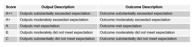 Just to prove I’m not making things up.
DFID thus suffers a kind of technocratic schizophrenia. It possesses the most transparent and open assessment mechanism in the world – and a scoring system designed to prevent any appearance of failure.

Not quite. Recieving an ‘A’ rating means a programme/project is delivering what we expected in the logframe agreed with us: surely we can’t ask for more than that?! We changed it to this system because we can legitimately expect more than that. The old system meant a maximum score for programmes/projects that only achieved what was asked. Now if it delivers more than expected it gets an A+ etc., as it has delivered more than anticipated. Maybe you or your school had low expectations, but we were always told to aim for As, not Bs: that was expected. If we went over and above what was expected you get a better score. It’s like tipping…I wouldn’t necessarily tip someone for simply doing their job, i.e. maybe an ‘A’ rating. I don’t like the standard 12.5% rate added etc. as standard, but I equally may leave some tip, depends on the person and the day. If someone goes over expectations, they get a tip (A+ or depending on the food/service, A++). If they go below expectations or the food isn’t up to scratch maybe I’ll complain B rating), or maybe I’ll get some money off my bill (C rating). Transparency is a good thing, and we need and will expect more of it from partners, but unfortunately I couldn’t see anywhere on your blog who the author of this was…..perhaps the question should be do organisations downplay what can be achieved to then get a better performance rating…and what measures we take to ensure this doesn’t happen
A good question from Lara Q (@thingsiknow): “and why must the grading scale match what schools use?”
Obviously it doesn’t need to – DFID can define grades as they wish. The grading system could rate from 1 to 5, or from A to E, or from muffins to chocolate (on a scale of delicious things).
But certain choices of scoring systems carry their own meaning. Although DFID defines ‘A’ as ‘meeting expectations’, in popular understanding ‘A’ means a good grade, someone who is really achieving highly. This is why a ‘straight A student’ is someone at the top of their class – not the middle. The school grading system is important because that’s where people get their preconceptions of what ‘A’ means. And, in that grading system, any grade between A and C is acceptable – that’s what you need in order to progress.
So I think that choosing to score projects from A++ to C is a slightly obvious media-management strategy on the part of DFID. It makes projects sound better than they are, to someone who is not familiar with the meanings that DFID use. This is not really terrible, and nothing in the above blog casts doubt on the quality of the ARs themselves. (Future blogs might 🙂 ) You could even argue that it’s the most sensible strategy for DFID to pursue, balancing the (very commendable) desire for transparency with the desire not to be beaten on the head by the Daily Mail et al.
I still think it’s an amusing contradiction worth pointing out.
Thanks for taking the time to delve into DFID’s programme scoring system.
You are right to champion the fact that we publish Business Cases, Annual Reviews and Project Completion Reviews online through DevTracker and are continually improving the site to make it easier to access and interrogate the data.
I wanted to respond on a few factual points to clarify project scoring in DFID as I think your blog misrepresents things somewhat.
Project Scoring
DFID projects are scored annually on the basis of achieved outputs. Projects can score one of 5 possible scores from C to A++, where A is defined as ‘outputs met expectation’. This scale allows for both over and under-achievement. The overall project score is based on calculations of score of each output within a project and its corresponding share of impact (i.e. each output has an impact weighting).
Portfolio Quality Index
Portfolio Quality index provides an aggregate measure of how well projects are performing on average. This is calculated by assigning a numerical score of between 50 and 150 to each output (i.e. a score of C would get 50 and a score of A++ would get 150). This is aggregated, weighted by total budget, throughout the organisation to give us a universal metric that displays performance against our expectations/ targets. If all projects were performing exactly as we expected, there would be a PQI of 100.
However, we work in complex environments where the context is constantly changing so there will be areas where the PQI score is below 100 and others where it is above. This is entirely normal and expected, contrary to your assertions.
We anticipate that a number of programmes programmes will under-deliver.
If programmes under-deliver against planned targets (our expectations), we will develop performance improvement measures that are included in delivery plans. We examine programmes carefully to consider whether we have designed the programme properly, considering the nature of the operating environment, the capability of our partners, the way we have managed it. We expect our staff to be objective and have internal challenge mechanisms to reinforce this objectivity. If a programme is no longer appropriate or poorly designed, we will consider whether to continue, restructure or close it.
We anticipate that a number of programmes will over-deliver.
Similarly, if programmes over-deliver against planned targets (our expectations) we will examine them carefully to understand why. Perhaps we had been too cautious or insufficiently ambitious in setting targets. Perhaps the overall operating environment had changed and it was easier to deliver than expected. At the Annual Review we will look carefully at the programme and determine the causes and consider options that might include raising the ambition of the programme or in some cases restructuring the programme to release resources for other priorities.
The scoring system provides management information to prompt a debate about how we can deliver the greatest impact we can with the resources we have. We will challenge under-performance and yet it may be that at an underperforming programme accompanied by robust management and learning is more valuable than an ‘over-performing’ programme that has low ambition or poor management. The key point is that performance management is as much an art as a science, with room for objective dialogue about what is working and what isn’t and careful judgements on appropriate actions.
Combined, this scoring system is designed to give us a nuanced view of programme and portfolio performance and to measure this balance between ambition and optimism.
We look forward to the rest of the blog series. Shout if you need help or further context!
Hi Pete,
Thanks for your insightful comment – about as a clear a description of the AR process as I’ve seen, and very useful for me.
I don’t think your comment is factually inconsistent with my blog, as far as I can see. My blog points out the oddity of having a scoring system from C to A++. As I say in an above comment, “I think that choosing to score projects from A++ to C is a slightly obvious media-management strategy on the part of DFID. It makes projects sound better than they are, to someone who is not familiar with the meanings that DFID use. This is not really terrible, and nothing in the above blog casts doubt on the quality of the ARs themselves.” The information in the Portfolio Quality Index is a useful complement to the Annual Review information, but I don’t see how it fundamentally challenges the key point.
I think the most important point you made is that performance management is ‘as much an art as a science’. That’s a valuable challenge to anyone who assumes that there is one “correct” way to score or run an annual review system. Future blogs are based on my analysis of the grades awarded so far (or at least a sample of them) so perhaps we can pick up the discussion based on that,
Aidleap
Two thoughts, on the art rather than science aspect, about logframe changes, and on comparability of outputs.
Logframe changes
It’s logical that a milestone or an output can be adjusted if the context has changed: if a war’s broken out, or if the implementers can’t access where they’re meant to go, are two hopefully uncontentious examples. And that’s good practical adaptive management.
But how many changes ought to be allowed? Is it ever claimed that the context has changed when it hadn’t beyond the bounds of reasonable predictability? Should the number of ‘tickets’, and the grounds, to make such changes be limited? e.g. in a rugby match you can only make a limited number of replacements – but you can always – in fact you must – make a ‘blood replacement’.
Comparability of outputs
DFID projects address a wide range of circumstances, and will thus have a wide range of outputs.
It’s good practical adaptive management to have the milestones and outputs be realistic, and focused on what’s critical path. If that means that the production of a strategy after six months is the first milestone, fine, and better than having a long management-information-free silence until you find after two years that a programme wasn’t on track to deliver the more tangible or comparable outputs.
But if there is not _any_ comparability of outputs (and by implication, unit costs), it’s difficult to know whether a given indicator is ‘too hard’ or ‘too easy’, and/or, what was achieved was worth the price paid.
In practice, DFID _does_ do this in its whole organisation Annual Report, presenting progress against its ‘results commitments’.
Would it be worth, then, the project AR template showing what results are being counted to those results commitments from each project for the last DFID corporate year (since ARs can happen at any time), and ideally a rough split of costs to outputs? That would enable some interesting, and open, analysis, which would be even faster if key AR data points were presented in a more readily machine-readable format than word/odt.
[Apols if double-posted – Juba connectivity]
Pingback: I analysed 600 of DFID’s Annual Reviews. Here’s what I found. | AID LEAP
Pingback: Why DFID’s monitoring doesn’t work – and how to fix it | AID LEAP